
Design Research Project
From Lab to Launch:
How We Mapped Foldable Device Interaction Zones

It all start with the hand
Two of my colleagues have shared their "thumb tendinitis" issue with me, characterized by pain and swelling near the wrist of the thumb, worsen with thumb movement.

Tenosynovitis, which is proven can be caused by repetitive manipulation of thumbs and fingers too much.
Despite reading about the link between mobile phone use and tendonitis, I initially didn't think it was the phone to blame. I suggested less time on the phone and Nintendo. TBH I didn’t really take this seriously until I joined a project on a foldable device.

I got this new machine for interface prototype work, an uncommon large-screen mobile phone at the time, with an 8.02-inch screen and a weight of 269 grams.
I mean, it’s cool, but also BIG.
It was a bit challenging to hold and tap with a single hand. After daily use I began to experience symptoms of pain in the root of my thumb, just as my colleagues had previously mentioned to me.
Large-sized folding screen mobile devices magnify discomfort symptoms that would normally only appear after long-term use on regular-size mobile phones. And it might be avoided by design.
💡
THE RESEARCH
We conducted mixed-method research to investigate users' capabilities and difficulty level when touching different areas of this foldable phone's screen.
Foldable phones enable more diverse tapping gestures, with increased index finger usage in touch interactions.
When using a foldable phone, users typically adopt a two-handed grip: one hand bears the weight while the other taps. As the weight-bearing hand stabilizes the device, the tapping hand must stretch further and move more across the larger screen. This extended reach and increased movement can lead to fatigue during prolonged use.

Design the experiment
Aim & Motivation
Our motivation was twofold: we wanted to know 1) the “touch heat zone” pattern for this new device, and 2) how to design the interface to enhance user comfort during tapping interactions.
Desk research
Some previous research has shown in the book “Designing Mobile Interfaces” (2011) designer Steven Hoober coined the term “The Thumb Zone” — the most comfortable area for touch with one-handed use.

“The Thumb Zone” for 5–4,7-inch display, if you hold the phone in the left and right hand, respectively.
However, this thumb-zone map no longer applies to our foldable phones in 2023 since the screen size is way bigger and the holding postures differ on different devices.
Looking into the holding postures
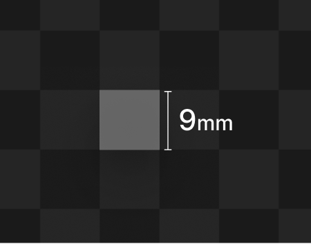
The entire inner screen is divided into approximately 9mm✖️9mm small squares. During the tasks, we collect the accuracy and speed of the user clicking on each small square Thus obtaining the heat zone distribution of the entire screen.
The holding posture as one of the variables is controlled, and buffers are set for each square.
We tested with 40 people, whose hand size falls into the “standard hand size range” (international standard).
>> ①st Round Test: Get the Most-comfortable Square
Participants are asked to tap on 10 square areas they find most comfortable or effortless for their hands/fingers. The area receiving the most taps is designated as the "most comfortable square." It then serves as the starting point to which participants must return before each subsequent tap.
the most comfortable square

>> ②nd Round Test: Collect user’s click data


Red area (accuracy rate≤25%)
Hard-to-reach zone: an area that most people find difficult to tap without moving their hand.
Black area (accuracy rate=0%)
Unreachable zone: an area that cannot be tapped without moving the hand.
The three crucial hot zone maps obtained after data cleansing:

Green area (accuracy rate≥75%)
Easy-to-reach zone: an area that most people can easily tap on.
Yellow area (accuracy rate 25%-75%)
Reachable zone: an area that can be reached with some effort without moving the hand.

RESULTS & FUN FACTS
Here is the one of the results we got from the test:
The numbers on the image represent the success rate (%) of tapping each square. The white square is the "most comfortable grid" we mentioned earlier (the initial position users return to after each tap), so the number on this square can be considered 100%.
By assigning corresponding colors to different values, we ultimately visualized the hot zone maps for the left and right hands.
IMPACT: GUIDELINES
Of course, here comes how we use the maps.
This heat map became a crucial guideline for interface design of similarly-sized foldable phones. The mindset of always considering "can users easily reach this with hands?" allows the designers to assess user experience impact through the lens of “touch hot zones” when confronting new device sizes.
Based on this experiment's results, I crafted a report with interface design recommendations for this foldable device, here are some of the examples 👇👇👇
Tip 1
Place non-interactive information in the upper area, and interactive components in the lower area
According to the hot zone map, areas towards the top of the interface are more difficult for fingers to comfortably reach, while areas towards the bottom are easily reachable. When designing interfaces, consider placing frequently used function buttons(or other components) in the lower areas.


This means you might want to check if some buttons are positioned too high on the screen to reach:
Tip 2
Carefully consider using completely centered controls

Centered buttons are in the 「yellow」 zone, making them not that easy to tap.
Tip 3
Split layouts normally work better on foldable devices


A split layout makes interactive elements easier to reach and touch.
Tip 4
Be cautious when using sliders that span across both halves of the screen
This likely requires users to stretch their fingers very far, or even have to adjust their grip to complete a single sliding.

More tips…
If you'd like to discover more inspiring tips, feel free to reach out to me : )
FUN FACT
Click accuracy significantly decreases in specific screen areas
In the green areas at the edges of both left and right maps, there is a noticeable dip. We have this hypothesis: clicking in this area may cause inaccuracies if the fingernail is perpendicular to the screen. Research supports this idea, showing that the angle at which a finger touches the screen can vary, and each click can be affected by the finger's angle in three dimensions. Certain clicking positions can influence accuracy.
We advise designers not to place important interactive elements in this area.


IMPACT & WORKSHOP
This heat map became a crucial guideline for interface design of similarly-sized foldable phones. The mindset of always considering "can users easily reach this with hands on your device?" allows the designers to assess user experience impact through the lens of “touch hot zones” when confronting new device sizes. Based on this experiment's results, I crafted a report with interface design recommendations for this foldable device.

I created paper prototypes to give workshop participants a tangible hands-on experience.

The workshop hosted by me.