
UX Design Project
Design customizable widgets
Background
It all started in a year when the company was making a move — shifting its strategy toward a more premium market. The marketing and user research teams ran extensive studies, talking to users across different device tiers to uncover what they valued most — their preferences, sensitivities, and expectations toward each feature.
As the UX designer responsible for the widget module, I was constantly asking myself: what kind of experience truly creates value for users, while also supporting the company’s high-end vision?
Through the reports shared by the marketing and research teams, a few meaningful patterns began to surface. One of them stood out: high-end users cared deeply about the widget editing experience — not just how widgets looked, but how effortlessly they could be customized and arranged to reflect personal taste and feature preference。
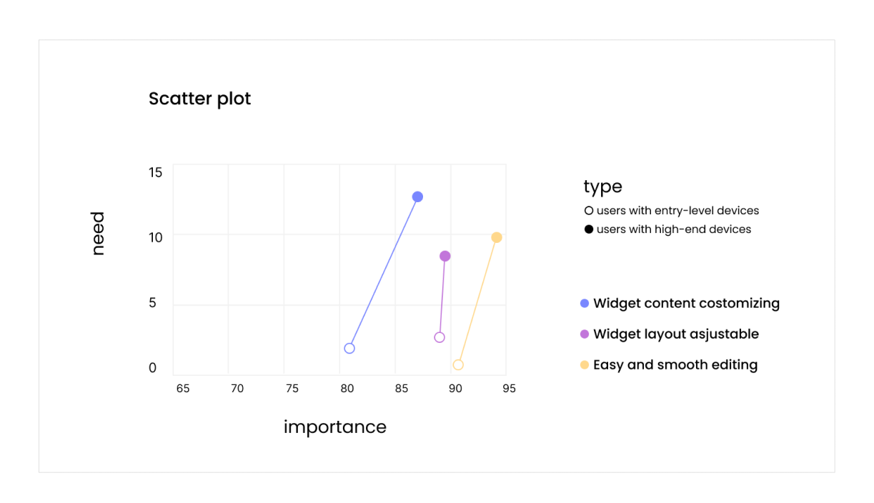
👆Source: Report from the marketing department
For a long time, the widget ecosystem had been facing two persistent challenges.
From the user side, as the Android platform continued to evolve, it accumulated a vast and diverse collection of widgets — those designed by our internal teams, by third-party creators, and by Google itself. This ever-growing variety made the system richer, but also more complex. Users were often overwhelmed by too many options, leading to high decision-making costs and difficulty finding what truly suited their needs.
From the designer side, each product cycle required creating new widgets from scratch. This “zero-to-one” production approach was time-consuming and inefficient, and it also introduced long-term maintenance challenges whenever the system’s design language evolved.
When we looked at these two pain points together, we discovered a clear high-ROI opportunity: improving the widget editing experience.
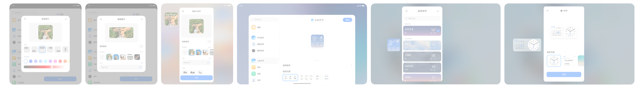
Rethinking the Widget-Adding Flow
So what was wrong with the old experience?
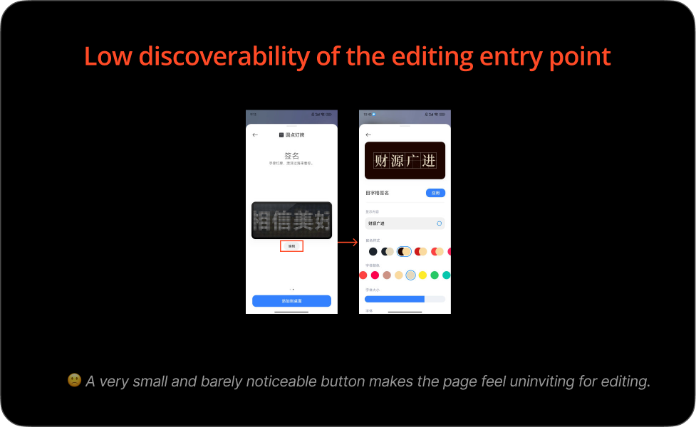
Low discoverability — The entry point for editing was hard to find.
[New]
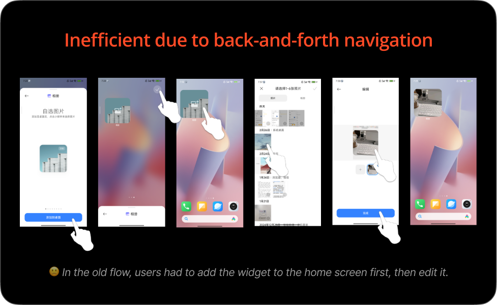
Inefficient workflow — Users had to go back and forth between adding and editing. In the old flow, a user needed to first place a widget on the home screen, then enter editing mode to make adjustments.
To solve this, I redesigned the flow by moving the editing step earlier in the process. This change made the entire experience more seamless and intuitive — like arranging a photo the way you want before putting it into a frame, rather than adjusting it once it’s already hanging on the wall. The new flow not only felt more natural but also aligned better with users’ real-world mental models.
Organizing the Workshop
Structure the Template
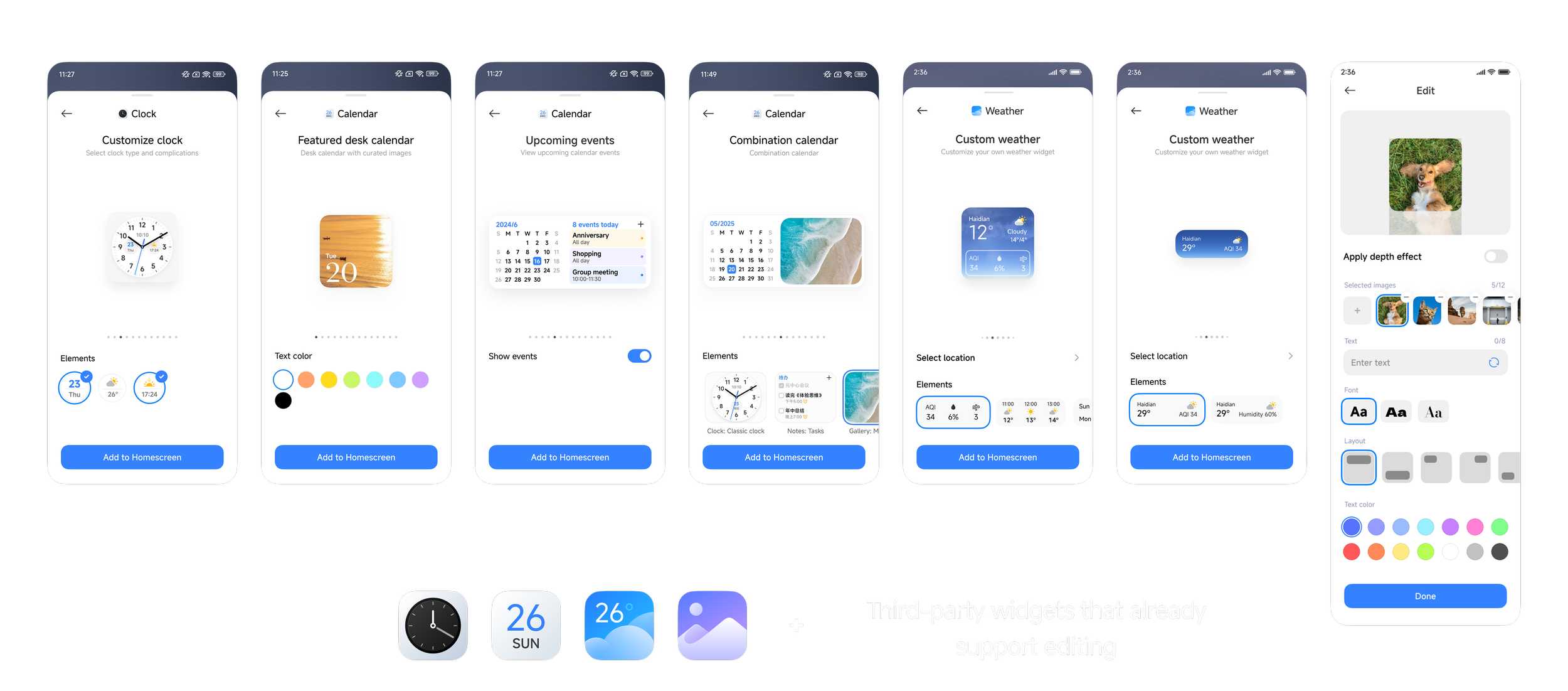
Apps Involved
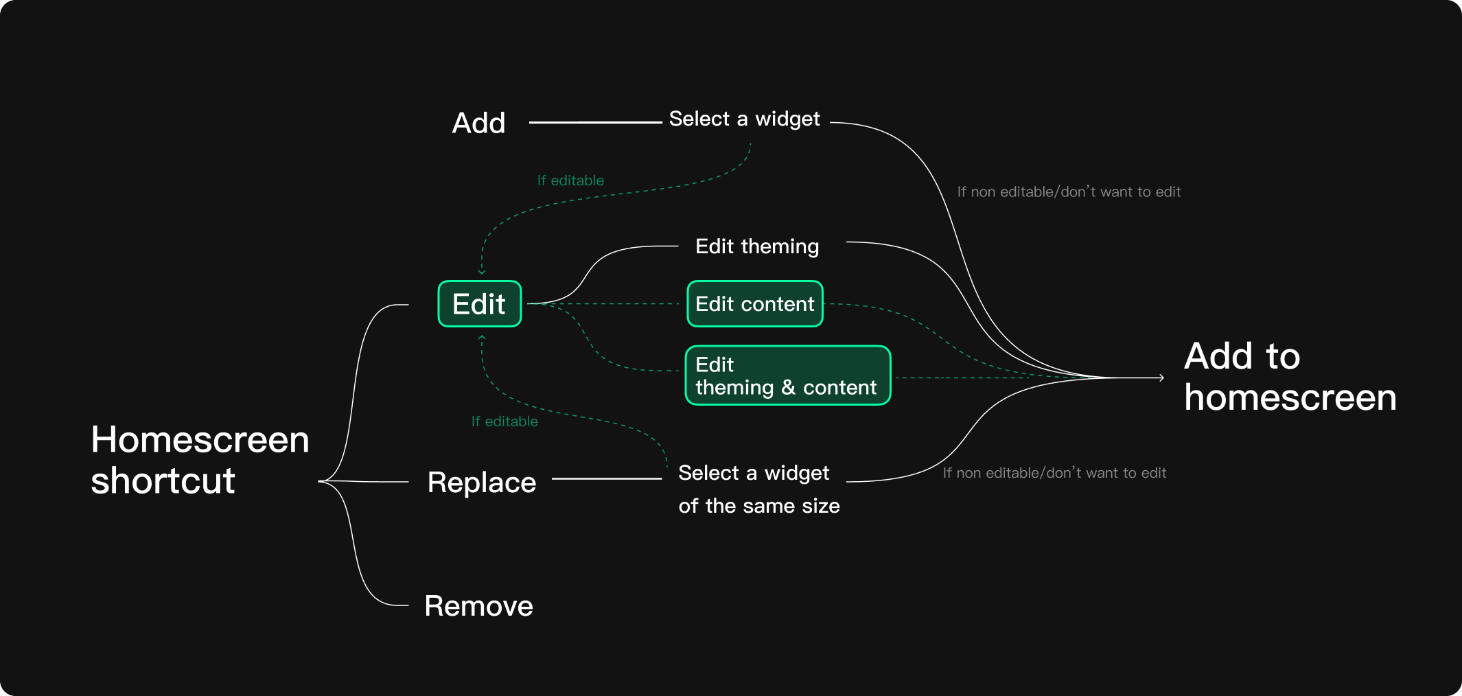
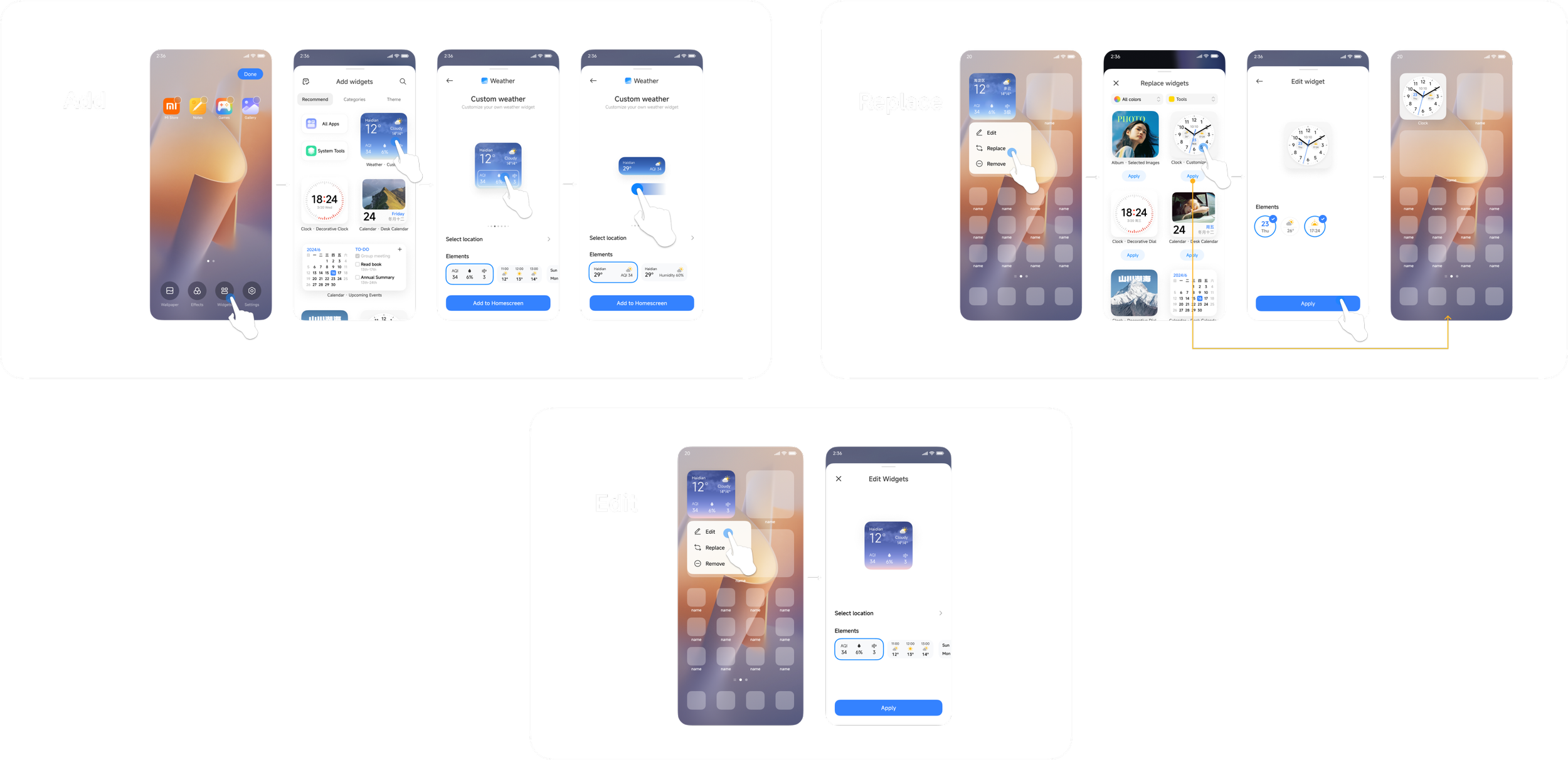
The Add/Replace/Edit flow

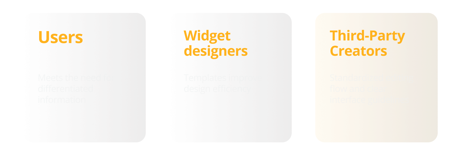
🌟 Impact for Different Stakeholders
* * *
The feature introduced above was launched with HyperOS 2.0 in 2024.
Thanks for reading!
To better understand user needs, we organized a workshop focused on uncovering what people truly want to customize and in what scenarios widgets bring the most value.
During the session, we explored questions such as:
What types of information do users most want to personalize?
In which contexts or scenarios do these customizations make sense?
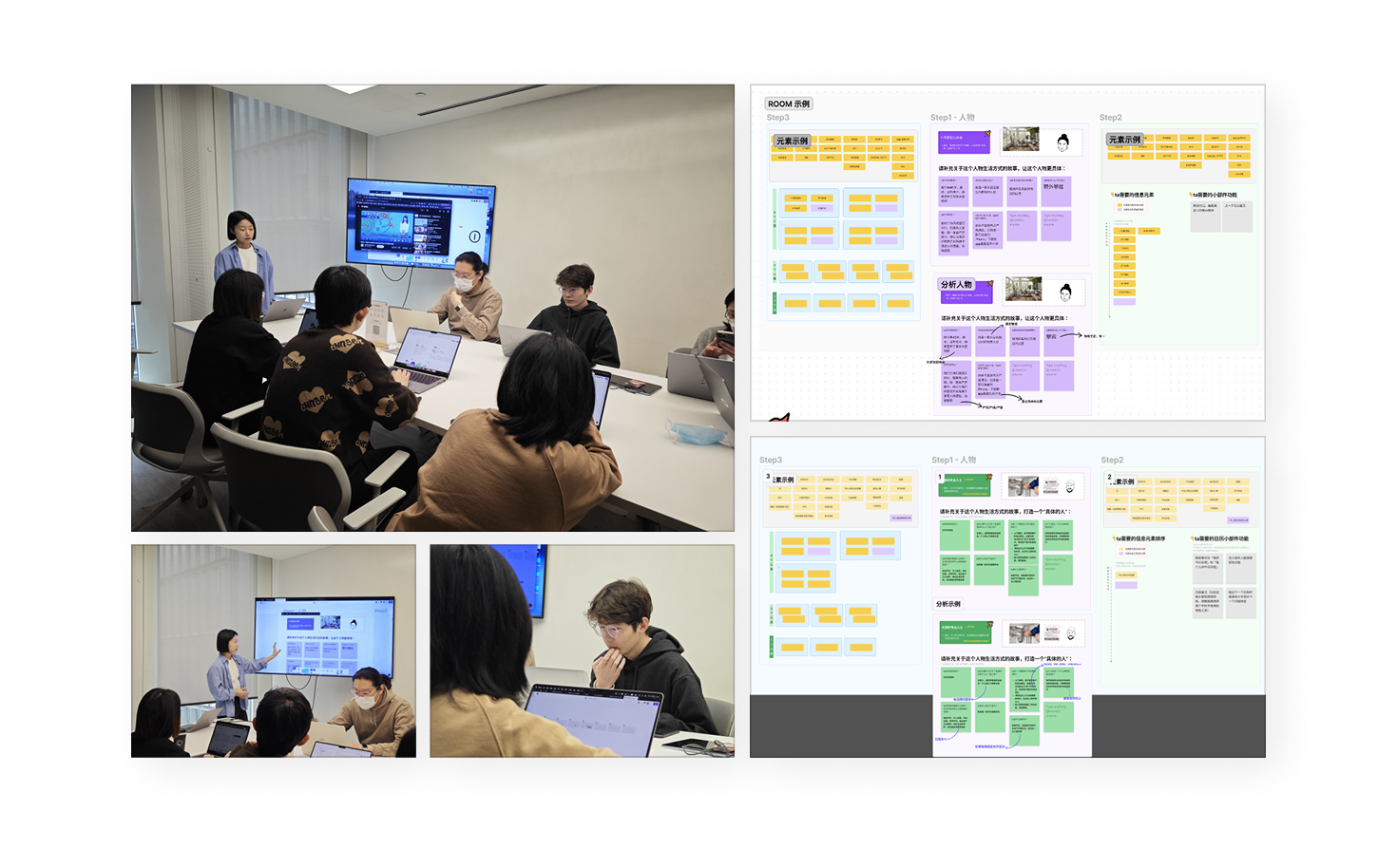
Our goal 🎯was to identify the core pieces of information users care about most, as well as the frequently occurring combinations of information that appear in specific scenarios. We then analyzed each element’s importance and relevance, laying the foundation for defining a more focused and meaningful widget experience.
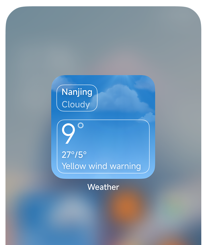
Analyze the Importance & Relevance of the Information
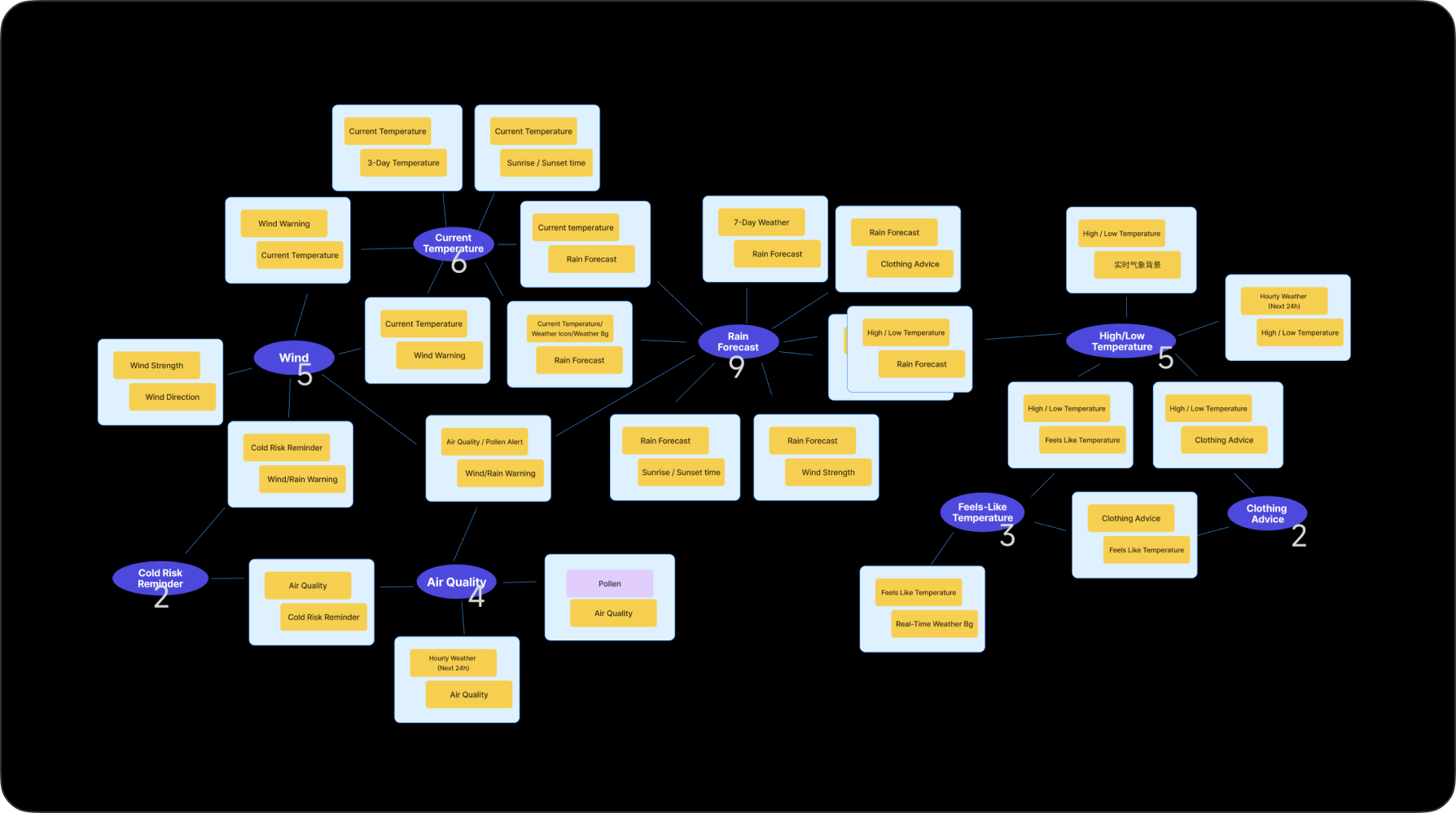
↑ Here, I use the Weather widget as an example. In fact, we've conducted a series of workshops on other apps as well, such as Calendar and Clock.
Identifying the Core Problems